Introduction
You might not expect Gestalt psychology to have any relation to the field of web design, but the truth is that there is a relation and one that is pretty strong. As web design developed tremendously in the past few years, it should come as no surprise that more and more people have learned about the theory of mind and the gestalt effect, the latter appealing to our senses and helping us see an image as a whole and not as a set of unrelated elements.
Today, Gestalt principles are successfully applied in the field of web design, explaining the way an image is perceived from a visual point of view. As an web designer, you should know that Gestalt principles can tell people how visual objects are perceived and also they will help you be better at what you do, creating greater designs and leaving a positive impression on your readers. Let’s find out the six most important principles that can be applied in web design.
#1 The proximity principle
Often times, the proximity principles is related to an underlying concept, meaning grouping. If you will spend some time browsing the Internet and reading articles that are written on the subject of web design, then it is practically impossible not to find grouping examples. The basic idea is that when we see several objects carefully arranged, we visually perceive them as being part of a group.
The proximity principle has been successfully applied when it comes to navigational links and sub-navigational links; you must have entered online and see a carefully arranged list of links, with the drop down navigational menus. Now you know that this is all psychologically arranged. Web designers have resorted to the proximity principle in order to group different types of images or logos. Their main desire was for people to understand the relation between the two groups, the importance of one over the other.
Everything on the web is practically defined by the proximity principle, whether we are talking about a simple web form that any user has to complete, the icons arranged on a web page or different menus that are made with this principle in mind for easy browsing. And it’s all related to the way we perceive things.
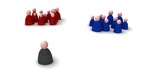
#2 The common fate principle

According to the common fate principle, if certain elements appear to be moving at once, then they are perceived as being part of a group. For example, if you were to have an image with several dots and you would be able to press a button in order to move let’s say six dots in one direction, then you would automatically perceive those dots as belonging to a group.
With the common fate principle, it seems that, as soon movement is noticed, relationships will start to develop. For a web designer, this principle is highly important, because one constantly seeks the relations between different elements; the way one element relates to the other is highly essential for the success of a web design project.
There are many examples that could be provided for those who are interested in seeing how the common fate principle applied. The dropdown menus are based on this principle, with the sub-menus and the link created between that and the original menu. Also, there are websites where you can clearly see that there are elements that are in conflict, with horizontal and vertical movements that are clearly mismatched.
#3 The similarity principle
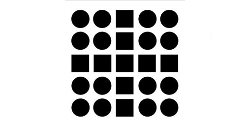
The explanation behind this principle is that similar elements are integrated into groups into an almost automatic manner. Depending on the attributes that have been used to describe similarity – color, form or size – you will see that the groups are automatically created because of the strong visual perception they create.
There is one more interesting fact that you should know about the similarity principle; for example, if you increase the distance between two groups, then the belonging to a certain group will be even more obvious. On the other hand, if you increase the distance between the elements that were previously part of a group, then they do not seem as if they would belong to the same group anymore. This is blunt out manipulation and it works very well for web designers.
In web design, the similarity principle is often applied, whether we are talking about choosing the same color for all the links or highlighting the icons that have similar purposes. This principle resorts to our perception and the unconscious tendency to put things into groups if they are similar in any way.
#4 The closure principle

One of the most illustrious Gestalt theories is that elements are grouped together if they belong to a figure that is closed. This is the closure principle and it functions really well for the field of web design; imagine logos that are made up by horizontal lines, dotted drawings that our mind renders as a complete image and the list could go on for a really long time.
Our mind fills in the blanks and completes the image, practically closing it. It is because we have a different perception that we are able to take such an action and provide ourselves with the elements that are missing from the image.
The visual wholes on which the closure principle relies form what is known as visual identity, but only if the right steps are taken. For example, you can change the color of a sub-group in order to offer its own visual identify and make sure that one perceives this group as being a separate closed figure.
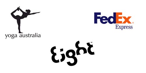
#5 The symmetry principle

The human brain is so complex that, when one looks at a certain image, our visual perception is concentrated on seeing and identifying the shapes that are symmetrical. Symmetry is appealing from an aesthetic point of view and this is exactly what this Gestalt principle is all about. For a web designer, deciding on the symmetry or asymmetry of a picture is an important thing, because one could take on a huge risk by going against the wind.
Even if there are two elements that are not connected but the symmetry principle has been respected, it should be noted that our mind still connects these. This Gestalt principle is often found in the making of logos and there are a few notable examples that could be offered, including the one of Pepsi.
In the end, all we have to ask ourselves is: does symmetry guarantee success or should we always consider the potential benefits asymmetry can bring to us?
#6 The figure ground principle
The figure ground principle is one of the most interesting Gestalt theories, being based on the relationship between objects and backgrounds. Even since the field of web design developed, specialists have tried to point out to the distinct problem of crowding the backgrounds with various elements, to the disadvantage of those that are in the foreground.
Today, web designers have learned that, in order to create amazing graphics or come up with unique logos, they have to take the figure ground principle into consideration. This means that the relationship between background and foreground is pretty strong and not taking it into consideration might be a big mistake for a web designer.
As a general conclusion, all the Gestalt principles are important for the work for a web designer and they should be carefully considered for each project.


0 comments
Posts a comment